At one point during the Unit 14 project, I researched superstitions as the theme for a possible response, and while I found them very interesting, I decided this was unsuitable because superstitions often develop over many generations and did not have quite the contemporary twist I was looking for. I found nautical superstitions particularly fascinating and would like to use some of these as the basis for future project derived from this one—perhaps with the Degree Show in mind. Wood type seems like an appropriate medium for a project on superstitions because of the habit of saying 'touch wood' for good luck.
Nautical lifestyles and their superstitions are extremely far removed from what most of us are familiar, which is probably what makes them so interesting, so I would like to showcase some of these superstitions alongside possible explanations for them.
What follows is a list of nautical superstitions, and some early thoughts as to how they could influence the direction of the project:
It is unlucky to start a cruise on Friday.
This is the day Christ was crucified on.
Never start a voyage on the first Monday in April.
This is the day that Cain slew Able.
Don't start a voyage on the second Monday in August.
This is the day Sodom & Gomorra was destroyed.
Starting a cruise on Dec. 31 is bad.
This is the day Judas Iscariat hanged himself.
Black traveling bags are bad luck for a seaman.
Avoid people with red hair when going to the ship to begin a journey.
Red heads bring bad luck to a ship, which can be averted if you speak to the red-head before they speak to you.
Avoid Flat-footed people when beginning a trip.
They, like red heads, are bad luck. The danger can be avoided by speaking to them before they speak to you.
A stolen piece of wood mortised into the keel will make a ship sail faster.
A silver coin placed under the masthead ensures a successful voyage.
Disaster will follow if you step onto a boat with your Left Foot first.
Pouring wine on the deck will bring good luck on a long voyage.
A libation to the gods.
Throwing stones into the sea will cause great waves and storms.
A stone thrown over a vessel that is putting out to sea ensures she will never return.
Flowers are unlucky onboard a ship.
They could later be used to make a funural wreath for the dead.
Priests are not lucky to have on a ship.
They dress in black and perform funural services.
Women on board a ship make the sea angry.
It was traditionally believed that women were not as physically or emotionally capable as men. Therefore, they had no place at sea. It was also observed that when women were aboard, men were prone to distraction or other vices that may take away from their duties. This, among other things, would anger the seas and doom the ship.
A naked woman on board will calm the sea.
This is the reason for naked figureheads.
Don't look back once your ship has left port as this can bring bad luck.
A dog seen near fishing tackle is bad luck.
Black cats are considered good luck and will bring a sailor home from the sea.
Swallows seen at sea are a good sign.
Sighting a curlew at sea is considered bad luck.
A cormorant sighted at sea is bad luck.
Dolphin swimming with the ship are a sign of good luck.
Killing one will bring bad luck.
It is unlucky to kill an albatross.
It is unlucky to kill a gull.
They contain the souls of sailors lost at sea.
Handing a flag through the rungs of a ladder is bad luck.
Loosening a mop or bucket overboard is a sign of bad luck.
Repairing a flag on the quarterdeck will bring bad luck.
Turning over a hatch will cause the hold to fill with seawater.
Cutting your hair or nails at sea is bad luck.
These were used as offerings to Proserpina, and Neptune will become jealous if these offerings are made while in his kingdom.
Church Bells heard at sea mean someone on the ship will die.
St. Elmo's Fire around a sailors head means he will die within a day.
When the clothes of a dead sailor are worn by another sailor during the same voyage, misfortune will befall the entire ship.
If the rim of a glass rings stop it quickly or there will be a shipwreck.
Never say the word "Drowned" at sea.
The caul of the head of a new-born child is protection against drowning and will bring the owner good luck.
The feather of a wren slain on New Years Day, will protect a sailor from dying by shipwreck.
A ships bell will always ring when it is wrecked.
A shark following the ship is a sign of inevitable death.
Sharks were believed to be able to sense those near death.
A sailor who died from violence or being lost at sea was said to go to "Davy Jone's Locker".
A sailor with over 50 years of service was said to go to "Fiddler's Green" when he died.
The Evils of the Banana
Bananas are a mainstay of most cultures and are the world’s most popular fruit. However, these deliciously yellow treats have no place at sea. Since the 1700’s, it has been widely believed that having a banana on board was an omen of disaster.
In the early 1700’s, during the height of the Spanish’s South Atlantic and Caribbean trading empire, it was observed that nearly every ship that disappeared at sea and did not make its destination was carrying a cargo of bananas. This gave rise to the belief that hauling bananas was a dangerous prospect. There are other documented origins to this superstition as well.
Another explanation for the banana superstition is that the fastest sailing ships used to carry bananas from the tropics to U.S. ports along the East Coast to land the bananas before they could spoil,” Chahoc said. “The banana boats were so fast that fishermen never caught anything while trolling for fish from them, and that’s where the superstition got started.
Another theory is that bananas carried aboard slave ships fermented and gave off methane gas, which would be trapped below deck. Anyone in the hold, including cargoes of imprisoned humanity, would succumb to the poisoned air, and anyone trying to climb down into the hold to help them would fall prey to the dangerous gas.
And finally, one of the better known dangers of bananas at sea, is that a species of spider with a lethal bite likes to hide in bunches of bananas. Crewmen suddenly dying of spider bites after bananas are brought aboard certainly would be considered a bad omen resulting in the cargo being tossed into the sea.
Any of these scenarios could be the reason behind fishermen’s mistrust of the yellow fruit, possibly all of them. Whatever the case may be, it is best that you don’t attempt to bring any bananas on board your next seafaring excursion, just to be safe.
—
Research nautical measurements and increments to define/inform total number of prints. Surely they don't use metric measurements? – 6 feet make a fathon...make 6 A3 prints (side to side they will be roughly a fathom)?
Could use stolen/found wood for the frames or to make type.
Could cobble together images by printing with different shaped offcuts from wood workshop.
Introduce strange superstitions with contemporary/familiar phrases – eg. ‘NO GIRLS
ALLOWED!’, or ‘We have no bananas today’
Visit sea-side/fi shing town and interview people about contemporary nautical superstitions. Are
there any more recent beliefs?
Could collect imagery/visual cues from different ships to inform design decisions.
Use lettering on sides of ships to inform typographic choices – could design a contemporary typeface based on interesting lettering. Perhaps cut from found wood to print posters with?
Collect flotsome and jetsome from sea-side to print with/use somehow.
Be sure to research the reasoning behind the supersition.
Saturday 22 May 2010
Science
In crits it was suggested that I considered how a contemporary message could be applied with the ancient typographic stylings of the Abracadabra charm. I found this a great challenge because I did not want to claim that something I created had magical powers when I knew full well that it did not. It felt a lot more honest to re-create the Abracadabra charm objectively in the present and let people make up their own minds about the potential of magic, than to try and create my own magic.
I began considering how in the Roman Empire, people had faith in magic and a plethora of Gods, and questioned what I myself believe in. The only thing I have faith in is science, and I considered how the word 'Abracadabra' could be replaced in the typographic charm by something relating to science, to illustrate how science has replaced magic and religion (at least for me it has).
I thought about using the names of scientists or famous scientific apparatus, but they seemed too obvious. Since the Abracadabra charm had a degree of mystery to it, I wanted these new prints to retain a degree of uncertainty. I recalled a TED Talk I watched a while ago, given by the scientist and author David Deutsch, where he asked why scientific equations were not immortalised in public monuments (as they are responsible for far more than any moral person could be), and he gave an example using the 4 equations that describe the Proton – Proton Chain Reaction; the principal nuclear reaction in our Sun, and by consequence the equation that is responsible for all life on Earth. I decided to use this equation for my prints.
The equations were printed using letterpress in the typographic style of the Abracadabra charm, with explanations of each equation printed on the back (science is meant to clarify the world, but as I said earlier I wanted these prints to maintain a degree of mystery, so the description was relegated to the back). Above each equation is printed 'INVENTORI LUCIS SOLI INVICTO AUGUSTO', which is Latin for 'To the contriver of light, Sol Invictus Augustis [the Roman Sun God]'. This is a nod to the historical heritage of the Roman typographic charm that inspired the prints, and also makes a direct connection to the Sun in each print.

Triangles
Escalated indents result in type being set in inverted triangles. Shapes, like colours, have no intrinsic meaning—just different values imposed onto them. Collected here are various examples of triangles in history & culture with an explanations of their significance.
 Pyramids—The distribution of weight in a pyramid, with more weight applied from above the higher the structure rises with greater support from bellow, made the pyramid structure ideal for early civilisations to build monumental structures. Also, they pointed towards the heavens, which was significant for cultures that often believed in many gods.
 Holy Trinity—Often represented as a triangle.
 Dragon's Eye—Ancient Germanic symbol. Combines triangle, meaning threat, with 'Y' meaning a choice between good and evil.
 Nazi Classification—The Nazis used a code of coloured triangles to classify prosecuted cultures. Pink triangles were used to identify homosexuals, but the symbol has since been adopted by the gay community.
 Recycling Symbol—Triangle most likely chosen as it is the simplest shape with corners necessary to create mobius strip effect.
 Star of David—Originally a magical protective symbol and only became associated with the Jews in the 17th century.
In Dan Brown's The Da Vinci Code, the triangle is a male symbol ('the blade'), and the inverted triangle is a female symbol ('the chalice'), and the Star of David is a combination of these. However, it should always be remembered that The Da Vinci Code is purely a piece of fiction.
 The Bermuda Triangle – A staple of conspiracy theories, adding to the triangle's seemingly mystical qualities.
 'Love Your Vagina' Posters—A contemporary use of escalated indents in a recent poster advertising campaign, but only used for the inverted triangle's obvious visual similarity to a vagina. The only other example I can find of an inverted triangle being feminine symbol is in Dan Brown's The Da Vinci Code, but that is factually dubious at the best of times.
Water Soluble Experiments
Since De Medicina Praecepta dictated that the Abracadabra charm be thrown into a river when it done with, I decided to experiment with water soluble materials, so I bought some cold water-soluble paper to print on.
The word 'Abracadabra' disappears in the typographic arrangement on the charm, so it seemed fitting that the object itself could also disappear in the medium prescribed by Sammonicus. Also, using a material with the amazing ability to dissolve quickly in cold water seemed to re-introduce a new, tangible element of contemporary magic.

The paper was too flimsy to be worn on its own, so it is kept in a frame around the neck and can be disposed of when it is no longer needed. I printed with both oil-based inks (with letterpress) and water-based inks (with silk-screen printing) to see what effect the water would have on the type when the paper dissolved. With the oil based ink, the letters retained most of their shape once the paper dissolved, and they floated around together which looked pretty spectacular.


I also made water-soluble papers. The intention was to use the logic of the Abracadabra charm on a larger scale. If worn around the neck, it blesses a person — if enlarged could it bless a whole building? I screen-printed some A2 posters on the water-soluble posters and found some derelict buildings which seemed like they needed some blessing and applied the posters to them. There is no rain forecasted for the next few days, so I tested one of the posters at home, and it dissolved quickly even when water was poured lightly.


Portable Items
Since the De Medicina Praecepta poem stipulated that the Abracadabra charm should be worn around the neck, I decided to experiment with portable items. I turned my first letterpress printed cards into necklaces by punching holds in the top and inserting thread.

The card-necklaces felt very flimsy, and would not have been able to withstand the 9 days of wear and tear required of them in the poem, so I decided to scan in the prints and enlarge them to make t-shirts.

I began thinking that the print could be used symbolically. It is effectively a symbol for 'healing' or 're-generation', so I tried printing it onto garments I bought from charity shops in an attempt to give them a new life and a new value.


Saturday 15 May 2010
Kings Cross Type Proposal
So here's a brief summary of my contribution to the Kings Cross ID/Signage competition...
The intention was to communicate CSM's heritage and its contemporary activities simultaneously; new within the old. The method I chose was to use a typeface based on mid-19th century British letterforms (which also reference the architectural heritage of the building we are moving to), but to fill it with an ever changing in-line. The 'base' typeface used was Leviathan (by Hoefler & Frere-Jones).
 The in-line could adapt to describe the activities of different departments. For example, chalk for the cafe:
 Broadway-style dots for the theatre:
 Books for the library:
 Or neon lights for the bar:
 The proposal for the different courses was to work with them to define a visual identity that matched their ethos, philosophy, or how they wanted their physical space in the new building to be percieved. For example, senior member of the fashion department said they wanted their space in Kings Cross to be a really basic, no-frills workshop area, so their in-line could be a clean san-serif:
 The in-line could even become an arrow, for use in way-finding:
 Unfortunately our proposal wasn't chosen, but there's been talk of me working with the uni on a different project as a result of this, so not all bad I guess. Let's see what the future holds!
Tuesday 4 May 2010
Checking In...
So I'm finally getting back to the Unit 14 project after working on the CSM Kings Cross identity project for the past few weeks. Bad news is we didn't get through to the next round, but one of the tutors who we had to pitch to was very complementary about my typographic contribution to the project (apparently it was "spot on"!) so at least I have a recent live project for my portfolio. Apparently I can submit my CSM-KX work towards my Unit 14 grade (which I think I will have to do considering how much time I've spent on it compared to the specific Unit 14 project recently), but I'm going to work on organising the research and presentation before I post about it.
I'm planning on heading back to letterpress this week to do some more printing. I've decided the next few prints are going to be about defining my initial research question, which was 'Where did typographic conventions like escalated indents come from, why did people use them, and where did they go?'. The aim of these prints is to be a point of reference I can relate all further work back to. Hopefully it should clarify the intention of my investigation and exploration for myself and anyone looking at it. I've learned that there's not too much point in working up roughs before heading to letterpress because of all the restrictions inherent with the process so I won't post any images for now (but to slightly contradict myself, it is interesting to compare the digital roughs with the finished letterpress print). I may post the roughs with images of the prints after they're all completed.
Anyway, today has basically been about writing a bit of an epic 'to-do' list for the next few weeks. We'll see where I end up.
Sunday 18 April 2010
Who knows...

If wearing the 'Abracadabra' charm around your neck is supposed to clear your body of illness, will it purge a room if it's above the door? This whole thing is starting to feel a bit daft, but I've put one of my letterpress prints above the door in my room. Maybe it will usher out all my creative demons and in will flow plenty of lovely inspiration for my final term at CSM?

Update...
So I haven't touched the blog for a while, and to be honest I haven't touched the Unit 14 project for a while...been busy with internship/Kings Cross project (next deadline looming just over a week away) and a few other bits and pieces. Anyway excuses over. Here's something I made at the end of last term.

It's a double sided A6 print with a translated passage from 'De Medicina Praecepta' (which I litterally just found out translates as 'On the Principles of Medicine') on one side, and 'Abracadabra' typographically rendered as prescribed by the passage. Just from printing this I learned alot about how working with letterpress can affect your work, and how its restrictions seem to be an intrinsic part of the process. I wanted to set the whole thing in Garamond, because it is in keeping with the geographical and historical context of the book I found this passage in, but had to use a mixture of Baskerville, Caslon and Bell (100,000 type-nerd points if you can identify which letters belong to which typeface in the scan). I'm going to punch holes in it and see what it looks like if you wear it as well.
I've also done a quick bit of research into water-soluble papers and fabrics and found that they do exist and seem quite easy to get hold of, so I may look into making soluble clothing or a soluble print since later on in 'De Medicina Praecepta' Mr. Samonicus says the paper Abracadabra necklace should be thrown into an East flowing river once it has been used...but I think that idea needs some working on. I'm also looking into the idea of replacing the 'Abracadabra' type funnel with a different passage/word. It's interesting how they believed the word has to be in that funnel shape for the charm to work, so maybe there's something to be done with changing the content but keeping the "language arranged in a certain way funnelling illness out" idea from the original text, but again...I need to think more about that.
I also printed this at the end of last term:
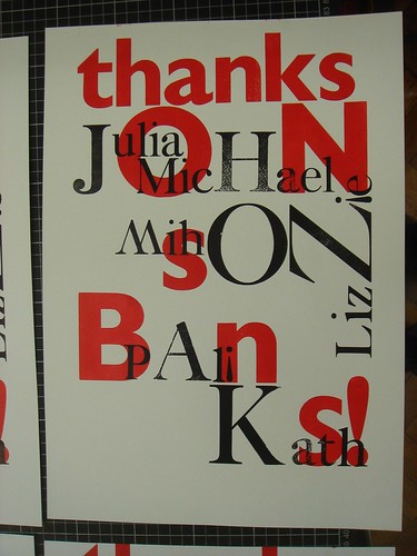 It's an A3 'thank you' print for johnson banks, who I went back to intern with this last Easter holiday. Seeing as this was my second time there and I knew all their names I thought I'd include them somehow. This was a real lesson in how working with letterpress is working with your hands tied. Since you are totally limited to what type you have, you have to be prepared to improvise and compromise constantly. Since the large Caslon cases at CSM had so many missing letters I had to replace some 'i's with upside down '!'s, and use an upside down 'W' for an 'M'. After working on this, it's easy to see where the whole miss-matched wooden type aesthetic came from...it's not out of deliberate quirkiness, it's from working with the inherent restrictions of physical type; if you're missing a letter, you have to work around it.
More pictures of these on my Flickr.

It's a double sided A6 print with a translated passage from 'De Medicina Praecepta' (which I litterally just found out translates as 'On the Principles of Medicine') on one side, and 'Abracadabra' typographically rendered as prescribed by the passage. Just from printing this I learned alot about how working with letterpress can affect your work, and how its restrictions seem to be an intrinsic part of the process. I wanted to set the whole thing in Garamond, because it is in keeping with the geographical and historical context of the book I found this passage in, but had to use a mixture of Baskerville, Caslon and Bell (100,000 type-nerd points if you can identify which letters belong to which typeface in the scan). I'm going to punch holes in it and see what it looks like if you wear it as well.
I've also done a quick bit of research into water-soluble papers and fabrics and found that they do exist and seem quite easy to get hold of, so I may look into making soluble clothing or a soluble print since later on in 'De Medicina Praecepta' Mr. Samonicus says the paper Abracadabra necklace should be thrown into an East flowing river once it has been used...but I think that idea needs some working on. I'm also looking into the idea of replacing the 'Abracadabra' type funnel with a different passage/word. It's interesting how they believed the word has to be in that funnel shape for the charm to work, so maybe there's something to be done with changing the content but keeping the "language arranged in a certain way funnelling illness out" idea from the original text, but again...I need to think more about that.
I also printed this at the end of last term:
It's an A3 'thank you' print for johnson banks, who I went back to intern with this last Easter holiday. Seeing as this was my second time there and I knew all their names I thought I'd include them somehow. This was a real lesson in how working with letterpress is working with your hands tied. Since you are totally limited to what type you have, you have to be prepared to improvise and compromise constantly. Since the large Caslon cases at CSM had so many missing letters I had to replace some 'i's with upside down '!'s, and use an upside down 'W' for an 'M'. After working on this, it's easy to see where the whole miss-matched wooden type aesthetic came from...it's not out of deliberate quirkiness, it's from working with the inherent restrictions of physical type; if you're missing a letter, you have to work around it.More pictures of these on my Flickr.
Monday 15 March 2010
Letterpress Work in Progress
For the last two days I've been working on my first letterpress project; to print a section of De Medicina Praecpta relating to the first recorded use of the word 'Abracadabra'. What's become quickly obvious is that working with letterpress is a constant stream of compromises. For example, I wanted to set the whole thing in Garamond (to match the French historical and geographical context of the book I found the passage in), but I had to use a mixture of Baskerville, Caslon & Bell. Perhaps that's part of the modern appeal of letterpress...your tools dictate what you can achieve, whereas you are in complete control of everything when you are working with type digitally. A Flickr set of my letterpress work can be found here.
I've done some more research into the genesis of the word 'Abracadabra' and found a few interesting possibilities. For instance, it may derrive from the Aramaic 'Evra KaDabra' which means 'I will create as I speak', or the Arabic 'Abra Kadabra', which translates as 'Let the things be destroyed'. It may also derrive from the Hebrew 'Ha-brachah'; 'the blessing'. I also found a text relating Abracadabra to Hebrew inverted cone blessings here.
I also found that later in De Medicina Praecepta, Sammonicus says that the 'Abracadabra' amulet should be worn for 9 days before being hurled over the shoulder into an East flowing river. Perhaps I could do some research into water-soluble materials/paper and print onto those.
Sunday 7 March 2010
The CSM Potato Print Press
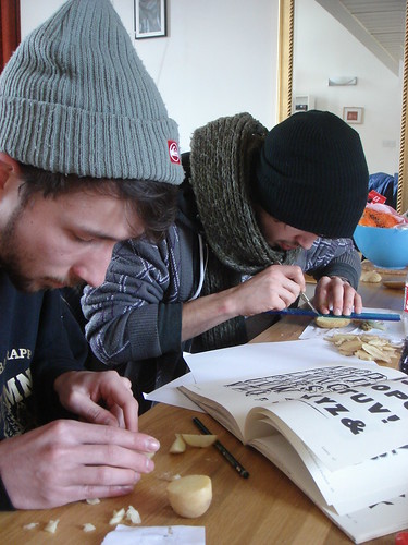
Next week our course has a stall at the Arts Market at LCC to help raise money for our degree show. Me and a course-mate, Alex Prior, have been talking about making our own wooden printing type (possibly as part of Unit 14, possibly just for shits and giggles) for a short while now, so physically making type has been on my mind quite a bit recently. We had the idea of printing typographic greetings cards and posters, made to order to sell at our stall over the course of the market using type we made ourselves. Since time was against us, we decided to make our letters out of potatos since they are soft and easy to cut and we wanted to make all 26 letters, something that would take too long if we used card, wood or lino. We also managed to recruit another course-mate David Weller to help out. So yesterday me and Alex made the journey from Hackney to David's place in Camberwell to start work on the CSM Potato Print Press.
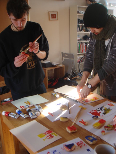 Since none of us are experienced type-cutters we decided to base our potato type on old wooden type letterforms for their charmingly naive shape and character. We made all 26 letters in several typefaces then decided to print some sample cards to get the ball rolling. Also...we're worried that the potatos won't last very long, so we wanted to get some items together that we can still sell if the potatoes don't make it past the weekend. Mother's Day is next weekend, hence all the 'Mum' cards.
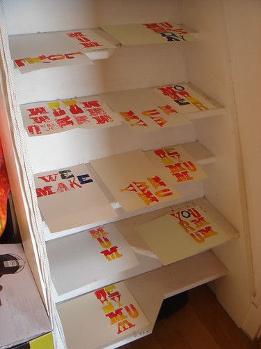
The market opens tomorrow, and we think that printing the cards to order may be a bit ambitious, so perhaps we'll just make some more 'M's & 'U's and print a bunch more Mother's Day cards, depending on how well they sell.
A Flickr set of all the pictures I took on Saturday is here, and I'll get some shots from the Arts Market on tuesday. Fingers crossed the CSM Potato Print Press will live for more than a week!
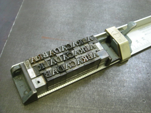
ABRACADABRA
I've wanted to set myself a letterpress project for a while now, but felt I could never find suitable subject matter or content. I think I'm going to use my Unit 14 research thus far as a letterpress starting point. Since the type treatment of Abracadabra seems to be the earliest example of escalated indents with a reason that I can fathom, I am going to start with that. De Medicina Praecepta was first written a good few hundread years before the invention of letterpress, but I'm going to use the 16th century Parisian printed edition I found in the British Library as my visual stimulus as this is my only real primary research I have so far. I think I'm going to familiarise myself with the process by setting 'A-B-R-A-C-A-D-A-B-R-A' as prescribed by Serenus Sammonicus on one side of A6 card and the translation of the passage on the other. Below is an initial proof:

I'm planning on printing it at A6 size so that I may be able to punch holes in the top of the card, and it could potentially be worn around the neck as is prescribed in the text. The design of my proof is based quite closely on the source material. The text is set in Roman capitals and italic lower-case (an old French typographic convention in itself I believe...I've seen it used in the opening credits of the film Prêt-à-Porter and on David Pearson's book covers for the French publisher Zulma) with the first character of each line capitalised, there is a drop cap, and the citation is hanging to the right in the margin. Admittedly I am quite uncomfortable with this level of visual referencing...it's a bit too close to pastiche for my liking which is definitely something I want to avoid with this project. However, this is really just to re-introduce myself to the letterpress department and, as I said, to familiarise myself with the process and with the conventions that I am interested in. In future I would like more of my own 'voice' to be present in any outputted work. We'll see how this goes...it may even be something I end up abandonning.


I'm planning on printing it at A6 size so that I may be able to punch holes in the top of the card, and it could potentially be worn around the neck as is prescribed in the text. The design of my proof is based quite closely on the source material. The text is set in Roman capitals and italic lower-case (an old French typographic convention in itself I believe...I've seen it used in the opening credits of the film Prêt-à-Porter and on David Pearson's book covers for the French publisher Zulma) with the first character of each line capitalised, there is a drop cap, and the citation is hanging to the right in the margin. Admittedly I am quite uncomfortable with this level of visual referencing...it's a bit too close to pastiche for my liking which is definitely something I want to avoid with this project. However, this is really just to re-introduce myself to the letterpress department and, as I said, to familiarise myself with the process and with the conventions that I am interested in. In future I would like more of my own 'voice' to be present in any outputted work. We'll see how this goes...it may even be something I end up abandonning.
De Medicina Praecepta
It seems the earliest reference to escalated margins I can find is from as far back as the 2nd century! It's the word 'Abracadabra' from a medical poem (which you really don't see many of these days!) by the Roman physician Serenus Sammonicus called De Medicina Praecepta! Apparently in this case the word was repeated 12 times, which the final letter being further omitted each time, resulting in a typographic funnel, that when worn on an amulet can remove illness from the body. The first printed version of the poem was printed by an Italian printer and publisher in 1484...which could explain how escalated indents first made it into Italian and Venetian printing and typography (although I think I would need more evidence if I really wanted to proove it).
I found a copy of De Medicina Praecepta in the British Library and took a look. The copy I found wasn't the 1484 Italian version, but was printed in 1533 in Paris. Here's the part that mentions Abracadabra (top paragraph on the right hand page):
 I sent this over to a friend who studied Latin and Greek at uni and he managed to translate it (roughly he claims) for me. More or less it reads:
It is fatal, the thing which the hemitriteum [some sort of fever, as far as I can tell] was published in Greek words, and this none of our ancestors wanted to say, nor (I think) were able to. You inscribe on the paper, the thing that is written Abracadabra, several times, and underneath you repeat it, you remove the final letter, and more and more the singular elements in the shape disappear, until the letter is reduced to a narrow cone, and let them remember to buy back their neck [life?] with these things having been tied with string. Some people remember that a lion’s fat is a benefit to them. And let the red and yellow [blood and fat?] connect in the skin of a cat, and do not doubt that the green emeralds mix with them, and let such chains pull the emeralds together lying around the neck, and drive away (a power to be admired) fatal illnesses. With limbs which were broken and fallen apart to be healed.
(…) – the actual brackets in the text
[…] – translator’s additions
Interesting stuff. I think I may have my first basis for my first introductory letterpress task now.
Manuscripts - Some Research
Since many early typographic conventions were derrived from the manuscripts which proceeded them, I decided to do some research on manuscripts, and even managed to find one with escalated indents in this book.

This manuscript was produced between 1164 and 1177, and the text layout is mental! It's the result of having multiple texts; Psalms, commentary, citations, subsequent corrections, cross-references and translations all running together. Couldn't find out what exactly the content of the text in the esclated margins at the bottom right column is though, but my (vaguely educated) guess is that it's an addition to the body text commentary on the Psalms made after the initial completion of the manuscript.
I still haven't found a precise reason for the use of escalated indents, in this decadent context it's quite likely that they are just used for aesthetic purposes. Still...isn't it pretty!?
Unit 14 – Initial Points of Interest
For a while now I've been interested in 'lost' or 'forgotten' typographic conventions, and am considering basing my Unit 14 project around them. One example of a lost convention that has caught my eye recently is 'escalated indents', which is where colums are set so that the text is justified, but line lengths decrease towards the end of a paragraph and are centred, so that they end in a 'point'. These seem to have been really popular in 16th century Venitian printing, and an example from 1545 by the printer Antonio Manuzio can be seen below:
 Another lovely lost convention is that seen in the printing and mixing of typefaces in Victorian playbill adverts like this one:

It's my guess most of these excessive conventions were effectively killed off by modernism. As much as I love aspects of modernism, I am getting rather bored of it, which is possibly what drew me to these typographic conventions in the first place...you just don't see them any more (unless it's a deliberate historical reference or pastiche). I also want to make use of the CSM letterpress studio before I graduate, seeing as I've kind of neglected it so far, and basing a project that uses a historical process on historical practices seems fair enough.
I've always been interested in where styles come from and the ideology behind them, and not just limited to design. For example...apparently baggy clothes became popular in hip-hop culture because people were skinnier when they left jail. Part of my dissertation looked at the ideology behind modernism and post-modernism, which I really enjoyed researching, so I may start by researching the reasons for these typographic conventions.
 Another lovely lost convention is that seen in the printing and mixing of typefaces in Victorian playbill adverts like this one:
It's my guess most of these excessive conventions were effectively killed off by modernism. As much as I love aspects of modernism, I am getting rather bored of it, which is possibly what drew me to these typographic conventions in the first place...you just don't see them any more (unless it's a deliberate historical reference or pastiche). I also want to make use of the CSM letterpress studio before I graduate, seeing as I've kind of neglected it so far, and basing a project that uses a historical process on historical practices seems fair enough.
I've always been interested in where styles come from and the ideology behind them, and not just limited to design. For example...apparently baggy clothes became popular in hip-hop culture because people were skinnier when they left jail. Part of my dissertation looked at the ideology behind modernism and post-modernism, which I really enjoyed researching, so I may start by researching the reasons for these typographic conventions.
Subscribe to:
Posts (Atom)