So I haven't touched the blog for a while, and to be honest I haven't touched the Unit 14 project for a while...been busy with internship/Kings Cross project (next deadline looming just over a week away) and a few other bits and pieces. Anyway excuses over. Here's something I made at the end of last term.

It's a double sided A6 print with a translated passage from 'De Medicina Praecepta' (which I litterally just found out translates as 'On the Principles of Medicine') on one side, and 'Abracadabra' typographically rendered as prescribed by the passage. Just from printing this I learned alot about how working with letterpress can affect your work, and how its restrictions seem to be an intrinsic part of the process. I wanted to set the whole thing in Garamond, because it is in keeping with the geographical and historical context of the book I found this passage in, but had to use a mixture of Baskerville, Caslon and Bell (100,000 type-nerd points if you can identify which letters belong to which typeface in the scan). I'm going to punch holes in it and see what it looks like if you wear it as well.
I've also done a quick bit of research into water-soluble papers and fabrics and found that they do exist and seem quite easy to get hold of, so I may look into making soluble clothing or a soluble print since later on in 'De Medicina Praecepta' Mr. Samonicus says the paper Abracadabra necklace should be thrown into an East flowing river once it has been used...but I think that idea needs some working on. I'm also looking into the idea of replacing the 'Abracadabra' type funnel with a different passage/word. It's interesting how they believed the word has to be in that funnel shape for the charm to work, so maybe there's something to be done with changing the content but keeping the "language arranged in a certain way funnelling illness out" idea from the original text, but again...I need to think more about that.
I also printed this at the end of last term:
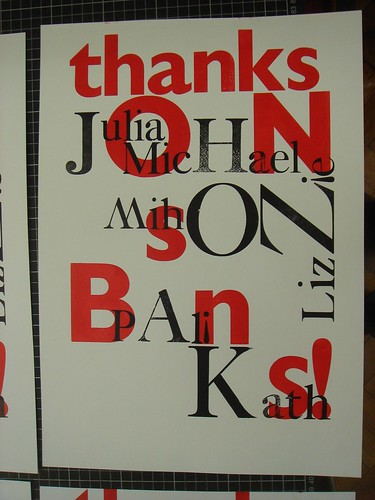
It's an A3 'thank you' print for johnson banks, who I went back to intern with this last Easter holiday. Seeing as this was my second time there and I knew all their names I thought I'd include them somehow. This was a real lesson in how working with letterpress is working with your hands tied. Since you are totally limited to what type you have, you have to be prepared to improvise and compromise constantly. Since the large Caslon cases at CSM had so many missing letters I had to replace some 'i's with upside down '!'s, and use an upside down 'W' for an 'M'. After working on this, it's easy to see where the whole miss-matched wooden type aesthetic came from...it's not out of deliberate quirkiness, it's from working with the inherent restrictions of physical type; if you're missing a letter, you have to work around it.
More pictures of these on my
Flickr.


