Monday 15 March 2010

Letterpress Work in Progress


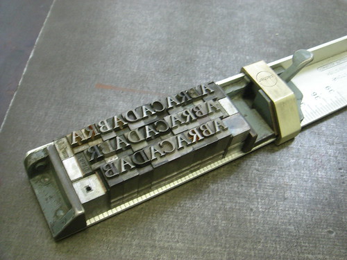
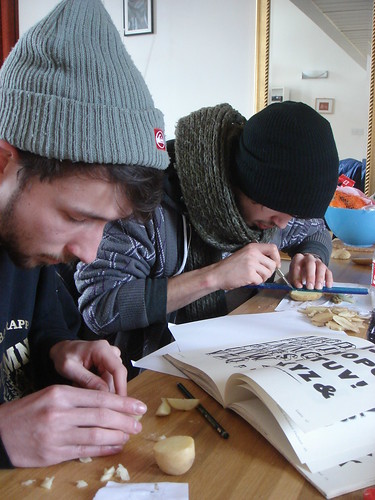
For the last two days I've been working on my first letterpress project; to print a section of De Medicina Praecpta relating to the first recorded use of the word 'Abracadabra'. What's become quickly obvious is that working with letterpress is a constant stream of compromises. For example, I wanted to set the whole thing in Garamond (to match the French historical and geographical context of the book I found the passage in), but I had to use a mixture of Baskerville, Caslon & Bell. Perhaps that's part of the modern appeal of letterpress...your tools dictate what you can achieve, whereas you are in complete control of everything when you are working with type digitally. A Flickr set of my letterpress work can be found here.

I've done some more research into the genesis of the word 'Abracadabra' and found a few interesting possibilities. For instance, it may derrive from the Aramaic 'Evra KaDabra' which means 'I will create as I speak', or the Arabic 'Abra Kadabra', which translates as 'Let the things be destroyed'. It may also derrive from the Hebrew 'Ha-brachah'; 'the blessing'. I also found a text relating Abracadabra to Hebrew inverted cone blessings here.

I also found that later in De Medicina Praecepta, Sammonicus says that the 'Abracadabra' amulet should be worn for 9 days before being hurled over the shoulder into an East flowing river. Perhaps I could do some research into water-soluble materials/paper and print onto those.

Sunday 7 March 2010

The CSM Potato Print Press


Next week our course has a stall at the Arts Market at LCC to help raise money for our degree show. Me and a course-mate, Alex Prior, have been talking about making our own wooden printing type (possibly as part of Unit 14, possibly just for shits and giggles) for a short while now, so physically making type has been on my mind quite a bit recently. We had the idea of printing typographic greetings cards and posters, made to order to sell at our stall over the course of the market using type we made ourselves. Since time was against us, we decided to make our letters out of potatos since they are soft and easy to cut and we wanted to make all 26 letters, something that would take too long if we used card, wood or lino. We also managed to recruit another course-mate David Weller to help out. So yesterday me and Alex made the journey from Hackney to David's place in Camberwell to start work on the CSM Potato Print Press.

Since none of us are experienced type-cutters we decided to base our potato type on old wooden type letterforms for their charmingly naive shape and character. We made all 26 letters in several typefaces then decided to print some sample cards to get the ball rolling. Also...we're worried that the potatos won't last very long, so we wanted to get some items together that we can still sell if the potatoes don't make it past the weekend. Mother's Day is next weekend, hence all the 'Mum' cards.


The market opens tomorrow, and we think that printing the cards to order may be a bit ambitious, so perhaps we'll just make some more 'M's & 'U's and print a bunch more Mother's Day cards, depending on how well they sell.

A Flickr set of all the pictures I took on Saturday is here, and I'll get some shots from the Arts Market on tuesday. Fingers crossed the CSM Potato Print Press will live for more than a week!

ABRACADABRA

I've wanted to set myself a letterpress project for a while now, but felt I could never find suitable subject matter or content. I think I'm going to use my Unit 14 research thus far as a letterpress starting point. Since the type treatment of Abracadabra seems to be the earliest example of escalated indents with a reason that I can fathom, I am going to start with that. De Medicina Praecepta was first written a good few hundread years before the invention of letterpress, but I'm going to use the 16th century Parisian printed edition I found in the British Library as my visual stimulus as this is my only real primary research I have so far. I think I'm going to familiarise myself with the process by setting 'A-B-R-A-C-A-D-A-B-R-A' as prescribed by Serenus Sammonicus on one side of A6 card and the translation of the passage on the other. Below is an initial proof:


I'm planning on printing it at A6 size so that I may be able to punch holes in the top of the card, and it could potentially be worn around the neck as is prescribed in the text. The design of my proof is based quite closely on the source material. The text is set in Roman capitals and italic lower-case (an old French typographic convention in itself I believe...I've seen it used in the opening credits of the film Prêt-à-Porter and on David Pearson's book covers for the French publisher Zulma) with the first character of each line capitalised, there is a drop cap, and the citation is hanging to the right in the margin. Admittedly I am quite uncomfortable with this level of visual referencing...it's a bit too close to pastiche for my liking which is definitely something I want to avoid with this project. However, this is really just to re-introduce myself to the letterpress department and, as I said, to familiarise myself with the process and with the conventions that I am interested in. In future I would like more of my own 'voice' to be present in any outputted work. We'll see how this goes...it may even be something I end up abandonning.

De Medicina Praecepta

It seems the earliest reference to escalated margins I can find is from as far back as the 2nd century! It's the word 'Abracadabra' from a medical poem (which you really don't see many of these days!) by the Roman physician Serenus Sammonicus called De Medicina Praecepta! Apparently in this case the word was repeated 12 times, which the final letter being further omitted each time, resulting in a typographic funnel, that when worn on an amulet can remove illness from the body. The first printed version of the poem was printed by an Italian printer and publisher in 1484...which could explain how escalated indents first made it into Italian and Venetian printing and typography (although I think I would need more evidence if I really wanted to proove it).

I found a copy of De Medicina Praecepta in the British Library and took a look. The copy I found wasn't the 1484 Italian version, but was printed in 1533 in Paris. Here's the part that mentions Abracadabra (top paragraph on the right hand page):

I sent this over to a friend who studied Latin and Greek at uni and he managed to translate it (roughly he claims) for me. More or less it reads:

It is fatal, the thing which the hemitriteum [some sort of fever, as far as I can tell] was published in Greek words, and this none of our ancestors wanted to say, nor (I think) were able to. You inscribe on the paper, the thing that is written Abracadabra, several times, and underneath you repeat it, you remove the final letter, and more and more the singular elements in the shape disappear, until the letter is reduced to a narrow cone, and let them remember to buy back their neck [life?] with these things having been tied with string. Some people remember that a lion’s fat is a benefit to them. And let the red and yellow [blood and fat?] connect in the skin of a cat, and do not doubt that the green emeralds mix with them, and let such chains pull the emeralds together lying around the neck, and drive away (a power to be admired) fatal illnesses. With limbs which were broken and fallen apart to be healed.

(…) – the actual brackets in the text

[…] – translator’s additions

Interesting stuff. I think I may have my first basis for my first introductory letterpress task now.

Manuscripts - Some Research

Since many early typographic conventions were derrived from the manuscripts which proceeded them, I decided to do some research on manuscripts, and even managed to find one with escalated indents in this book.


This manuscript was produced between 1164 and 1177, and the text layout is mental! It's the result of having multiple texts; Psalms, commentary, citations, subsequent corrections, cross-references and translations all running together. Couldn't find out what exactly the content of the text in the esclated margins at the bottom right column is though, but my (vaguely educated) guess is that it's an addition to the body text commentary on the Psalms made after the initial completion of the manuscript.

I still haven't found a precise reason for the use of escalated indents, in this decadent context it's quite likely that they are just used for aesthetic purposes. Still...isn't it pretty!?

Unit 14 – Initial Points of Interest

For a while now I've been interested in 'lost' or 'forgotten' typographic conventions, and am considering basing my Unit 14 project around them. One example of a lost convention that has caught my eye recently is 'escalated indents', which is where colums are set so that the text is justified, but line lengths decrease towards the end of a paragraph and are centred, so that they end in a 'point'. These seem to have been really popular in 16th century Venitian printing, and an example from 1545 by the printer Antonio Manuzio can be seen below:

Another lovely lost convention is that seen in the printing and mixing of typefaces in Victorian playbill adverts like this one:


It's my guess most of these excessive conventions were effectively killed off by modernism
. As much as I love aspects of modernism, I am getting rather bored of it, which is possibly what drew me to these typographic conventions in the first place...you just don't see them any more (unless it's a deliberate historical reference or pastiche). I also want to make use of the CSM letterpress studio before I graduate, seeing as I've kind of neglected it so far, and basing a project that uses a historical process on historical practices seems fair enough.

I've always been interested in where styles come from and the ideology behind them, and not just limited to design. For example...apparently baggy clothes became popular in hip-hop culture because people were skinnier when they left jail. Part of my dissertation looked at the ideology behind modernism and post-modernism, which I really enjoyed researching, so I may start by researching the reasons for these typographic conventions.